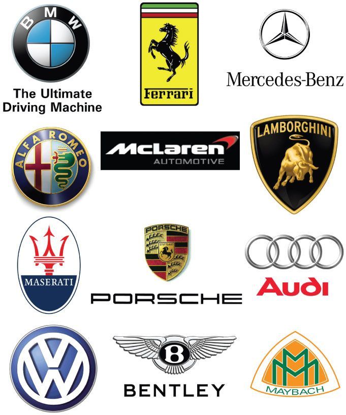
Fun Facts
Menlo Park, California, United States
Calling all the car lovers out there who like to know every possible thing there is to know about their beloved cars!

highend
Have you ever wondered when looking at your dream car what the creators of the company were thinking when they created the badge because we can all admit that the design of some of the logos are very bizarre!
Fear not because we have found some fascinatingly fun facts about some of our favourite car logos to put an end to all the wondering we have all felt when looking at them. So here are the answers you have been waiting for about the history of your cars original identity:
Aston Martin
Let’s kick things off with our favourite British born brand; the amazing Aston Martin!
The original name for Aston Martin was Martin and Bamford Limited. When the company decided to start providing sports cars in 1927 the name changed meaning it needed a new sign for its identity. They decided to base the logo around a wing pattern in order to show what the company was truly about – speed. Prior to this the logo was simply a circle which held the companies ‘A.M’ initials in.
Mercedes
The stunning crisp logo of Mercedes was based around the main goals and aspirations of the motorcar company. This German born company have always aimed to create easy transportation for land, water and air which was why the exquisite logo holds three points and sort of looks like a three pointed star.
Porsche
The also German born supercar company, Porsche logo was based on a more personal note to the country it was born in. The logo features the red yellow and black colours of the German flag and the name of the city where the company is based (Stuttgart. This is all centredaround an image of a black stallion to represent the companies car aims – power and speed. The reason why there is a horse in the middle of the image is because horses are a big part of the Stuttgart city as they are bred there.
Ferrari
Possibly the world’s most iconic brand logo has got to be Ferrari’s stallion! This car logo is known all over the world by everyone –even by people who do not know a thing about cars! The history behind this logo has got to be my personal favourite as it was originally the emblem of a WW1 hero Francesco Baracca who would paint it on his plane as a sign of good luck. When Baracca died, his mother persuaded Enzo Ferrari to carry on Baracca’s tradition by using it on his Alfa Romeo race cars. So when Ferrari started up his own supercar company he decided to honourBaracca in his logo along with a yellow background for Ferraris birthplace, Modena.
BMW
Originally, BMW were suppliers of airplanes to the German government in the early 1900s. Once they decided to start manufacturing cars and motorbikes, they changed the logo and it was assumed that the logo represents white propellers spinning in the blue sky; however this is a very inaccurate assumption. The logo actually evolved from the emblem of ‘Bayerische Motoren Werke’ which was later abbreviated to BMW, & then became Bastard Men With (small penises in traffic). The colours of the logo represent the Bavarian flag.
As nouns the difference between bimmer and beamer is that bimmer is (slang) a bmw: a car manufactured by, while beamer is (cricket) a ball, presumed to have been bowled accidentally, that does not bounce, but passes the batsman at head height.
The only real difference that we can discern is that one drives with the prick on the inside 😉
You must be logged in to comment
Login now